Be yourself; Everyone else is already taken.
— Oscar Wilde.
This is the first post on my new blog. I’m just getting this new blog going, so stay tuned for more. Subscribe below to get notified when I post new updates.
Be yourself; Everyone else is already taken.
— Oscar Wilde.
This is the first post on my new blog. I’m just getting this new blog going, so stay tuned for more. Subscribe below to get notified when I post new updates.
I have learned a lot in the past five weeks. I have learned how to study and live in the UK. In addition to this, I also learned some skills, first of all, the ability to do research. I didn’t know how to research before I came to UCA. I don’t know what direction of research to investigate. During this time of the study, I learned that research is your source of inspiration and your learning channel. Secondly, I know that the sketchbook not only has your idea of the work but also records all the information you found while working on the project. Thirdly, I also learned a very clear way of taking notes. Divide a piece of paper into three parts, record the keywords on the left, record the details on the right, and summarize the contents at the bottom of the paper with your own words. That way your notes are brief and clear. Last but not least, I learned the ability of how to reference and presentation skills. You have to stand on the stage with confidence, using some body-language and eye contact to make the presentation natural.
I have a lot of expectations for the future. I browsed the timetable and found that we have a lot of time to spend in the workshop. This form of the lesson was not experienced in my previous studies. So I am looking forward to seeing more and getting inspiration, and I hope that my ideas can be turned into finished products in the workshop. I am very interested in branding and front design. Fortunately, I found my tutor is Catharine Slade-Brooking. She is very good at branding, making me look forward to lessons in the future. I hope to improve my design skills through later study.
This project is to explore the future development of your field. Because of my major is Graphic Communication, I did some research about three very famous graphic designers.
The first artist is Louise Fili. Louise is very good at typography and loves the cover design very much. She has designed a large number of book covers. The reason she started designing the book cover is that she feels the book covers designed by designers who like to use fixed fonts were boring. This is a very interesting reason. These designers feel that redesigning the font will cause more trouble because if the font is redesigned, it needs to be re-created templates in the printing. This is very time consuming and expensive. And she still insists on hand drawing until now. she said, “My design process is still the same since I don’t use a computer—although I rely on my skillful staff to bring my sketches to life digitally.”
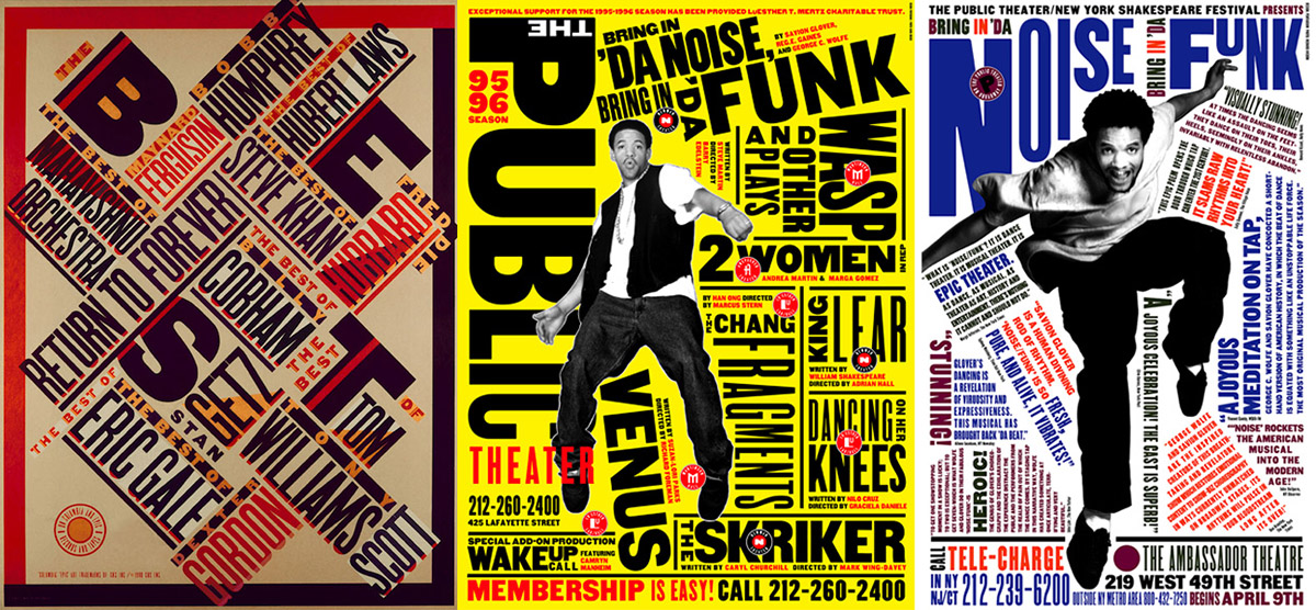
The second artist is Paula Scher. Paula is also very good at font design, she also did some environment graphic design. Her most of works include typography. In Paula’s works, you will see a lot of text so some people say that her design is maximalist. But Paula said, “less is more, more is more, it’s the middle that’s not a good place”. I don’t think this sentence is completely corrected , but minimalism or maximalist will make it easier to form a design style.
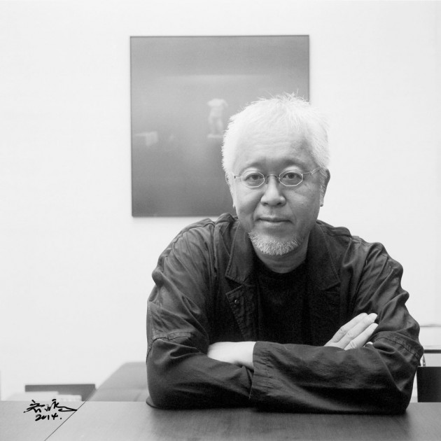
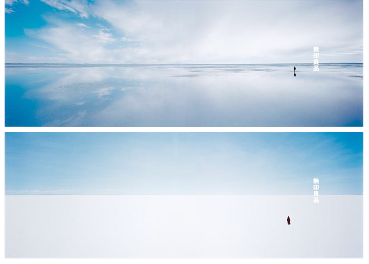
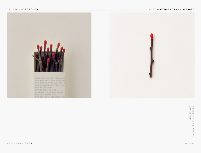
The third artist is Kenya Hara. Kenya is a Japanese designer. He has many identities. He is a graphic designer, a university professor, a curator and an artistic director of MUJI. RE-DESIGN is an exhibition he planned in 2000. He invited many designers to participate . Designers used daily necessities or common objects in our life to design. The work in the photo is a match made with dry branches. “Horizon” is a series of posters for MUJI. These posters are all designed by Kenya. His style is minimalist, he believes that design needs return to the source. And he thinks that all design can not only consider short-term but also focus on long-term impact.
In today’s class, we learned about a famous British architect, Thomas Hetherwick, through a TED talk. In my opinion, he is not only an architect but an artist. Because he not only participated in architectural design, he also designed London buses and sculptures, and he participated in a wide range of designs. And his works are very creative and wonderful.
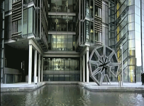
Roll Bridge is one of his very famous works. This bridge can be opened and closed. Every Friday, the bridge will be opened for people to travel. At other times, the bridge is closed and forms a polygon. This design made the bridge not boring and attract people’s attention. when the bridge is closed, it can be viewed as a sculpture. Make this design both practical and enjoyable.
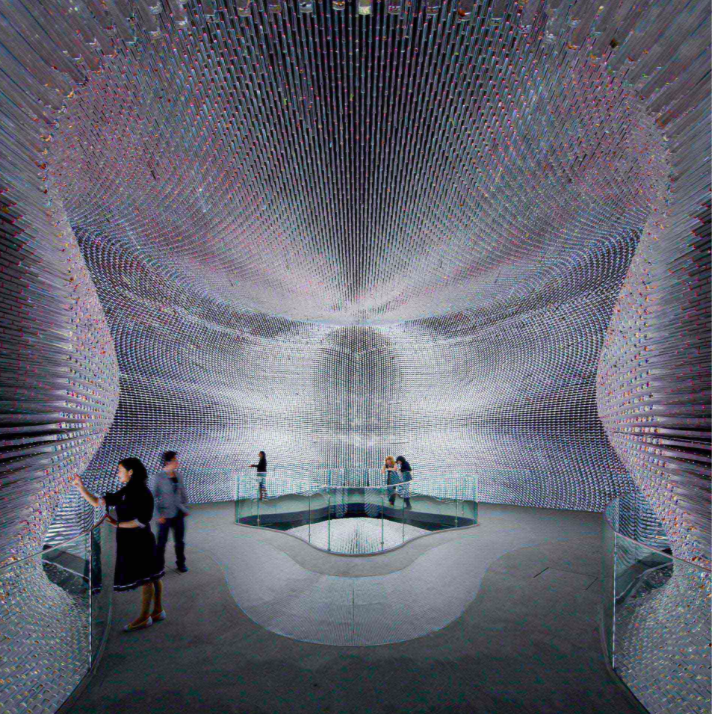
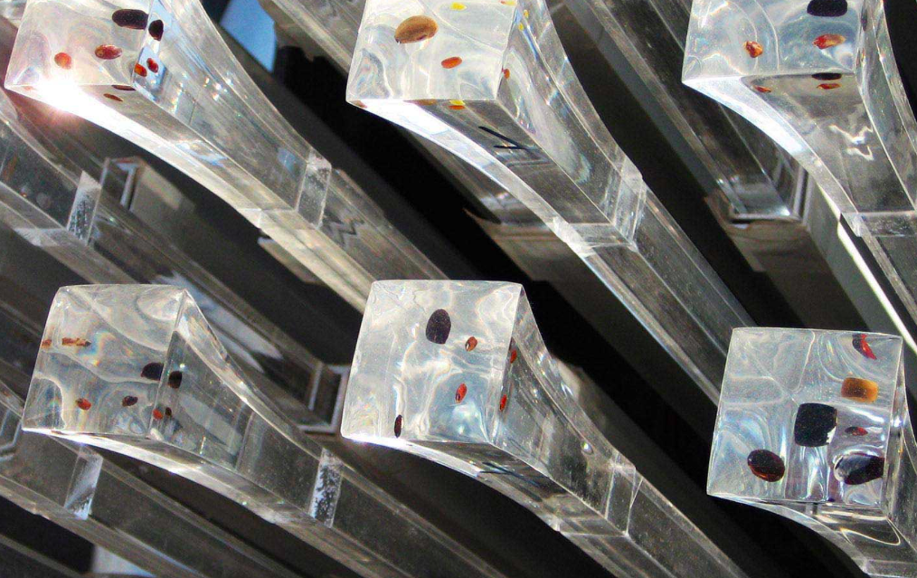
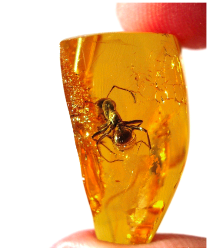
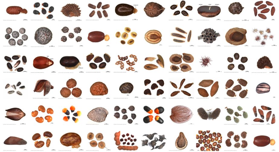
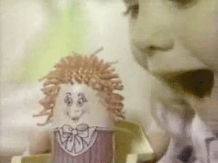
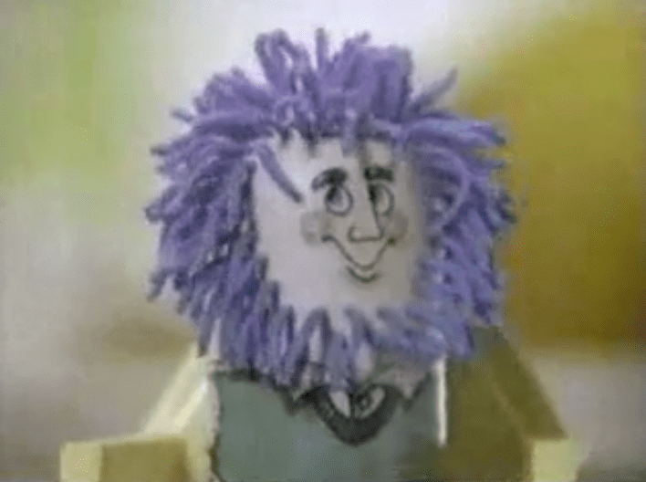
The work that impressed me the most is the UK Pavilion in Shanghai. This building is made up of a lot of acrylic tubes, and the seeds of the plants are placed on the top of each tube. I heard that this inspiration comes from amber. This design also makes this exhibition hall like a book that can introducing plant DNA. Not only that the whole building was inspired by a toy that by squeezing the doll’s hair will grow out of the head. I think that idea is very cool. That also made me realize that a lot of inspiration comes from the objects in our life so we should pay attention to everything around us.
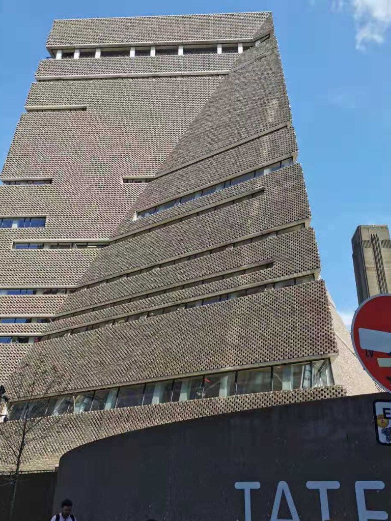
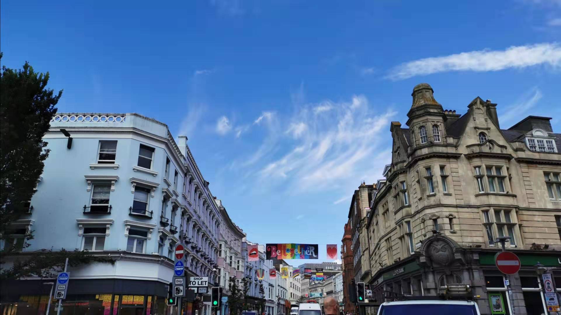
23rd Aug is the first time I arrived in London after studying in the UK. London is a very busy and fashion city. Pedestrians and a variety of illustrations and posters are everywhere on the street. The tutors arranged for us to visit Tate Modern. Tate Modern’s building is high and modern. when you saw this building, you will think it is a very hard building because it is a honeycomb-like structure built of bricks.
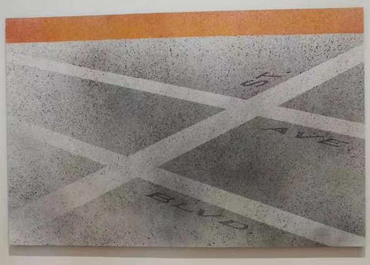
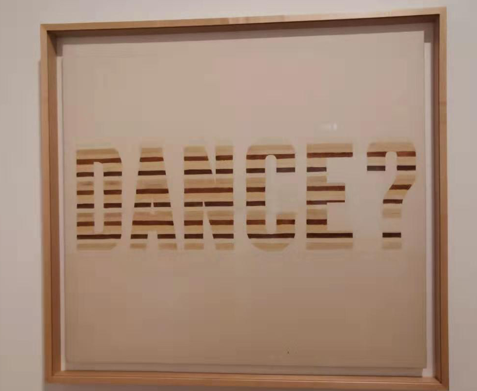
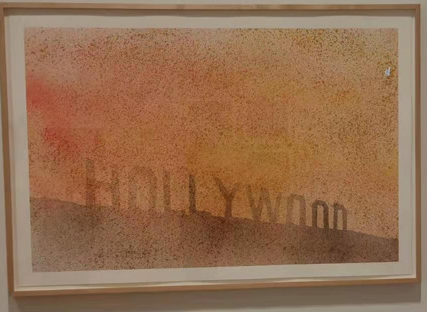
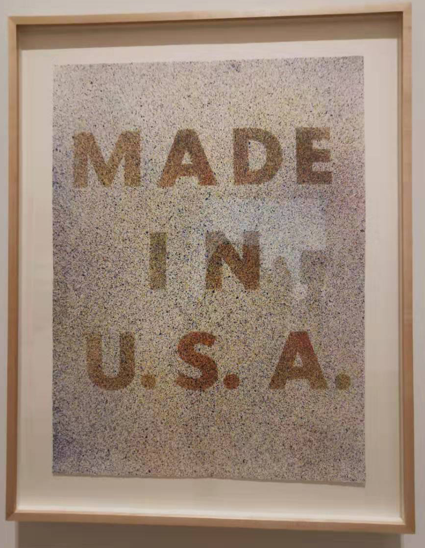
As for me, I am very interested in the front design. I saw some works on the font design in the exhibition. Although the designers didn’t change the fonts, these fonts are still very common . But they use some colors to highlight these fronts made these posters just have some words but can attract people’s attention. This method makes me thought that if I want to make a poster with the title which is catches the eye. You cannot do very complex fronts. You can use color change to attract people’s attention.
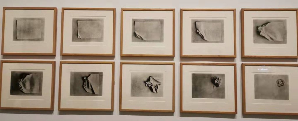
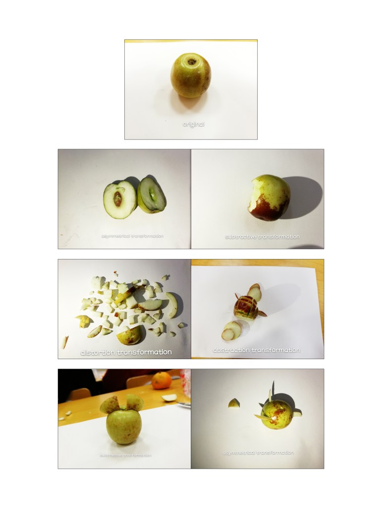
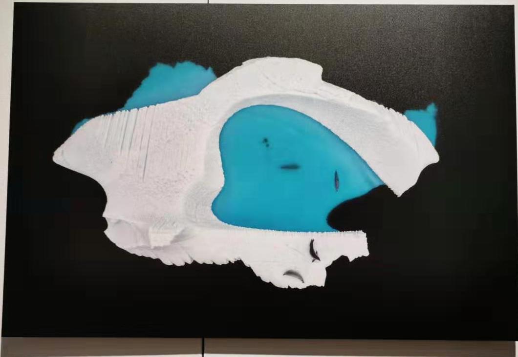
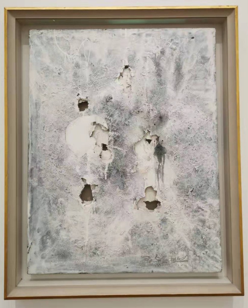
I also saw a very interesting work in the museum, which is a photo of the process of recording a complete piece of paper into a paper ball. This reminds me of a work I used to express a different state with jujube. I used jujube to express a lot of transforms such as subtractive, asymmetrical, distortion and abstraction, etc.
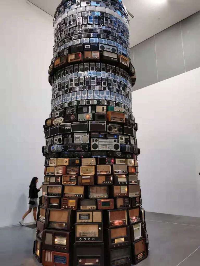
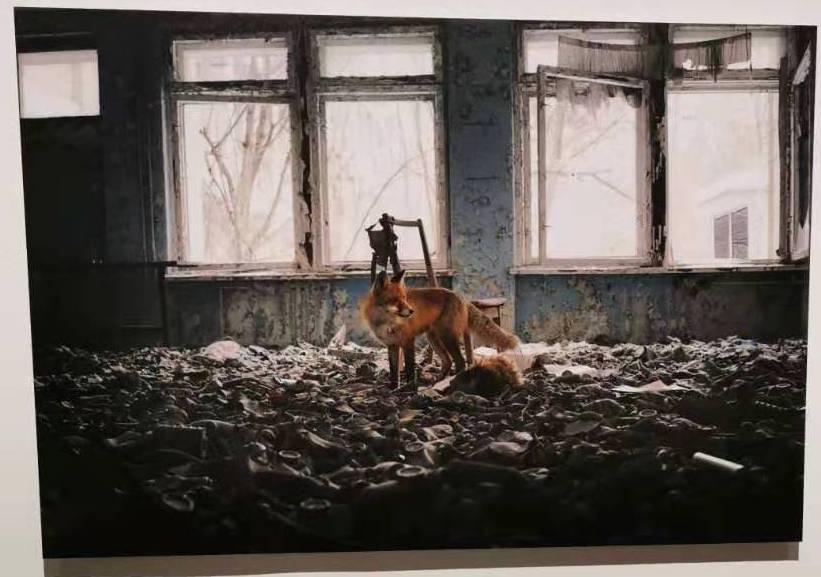
What impressed me the most in the exhibition was the tower with radios of different ages. The lowest level radios are the oldest and the highest level radios are the latest. This tower is very spectacular work and every radio is working. Nowadays most people not use radios at home. These radios of different ages not only witness the development of times but also the recycling of the radios .
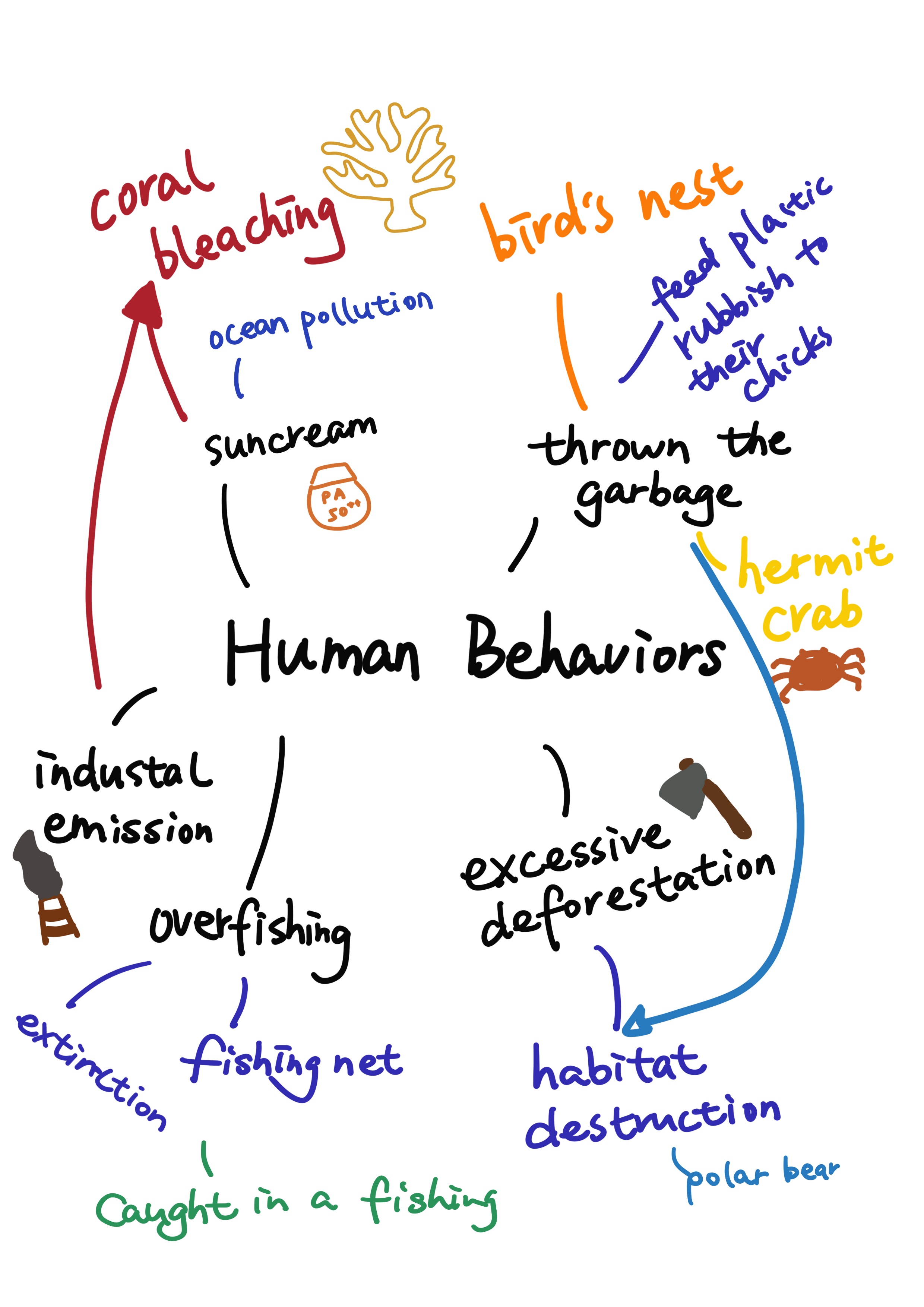
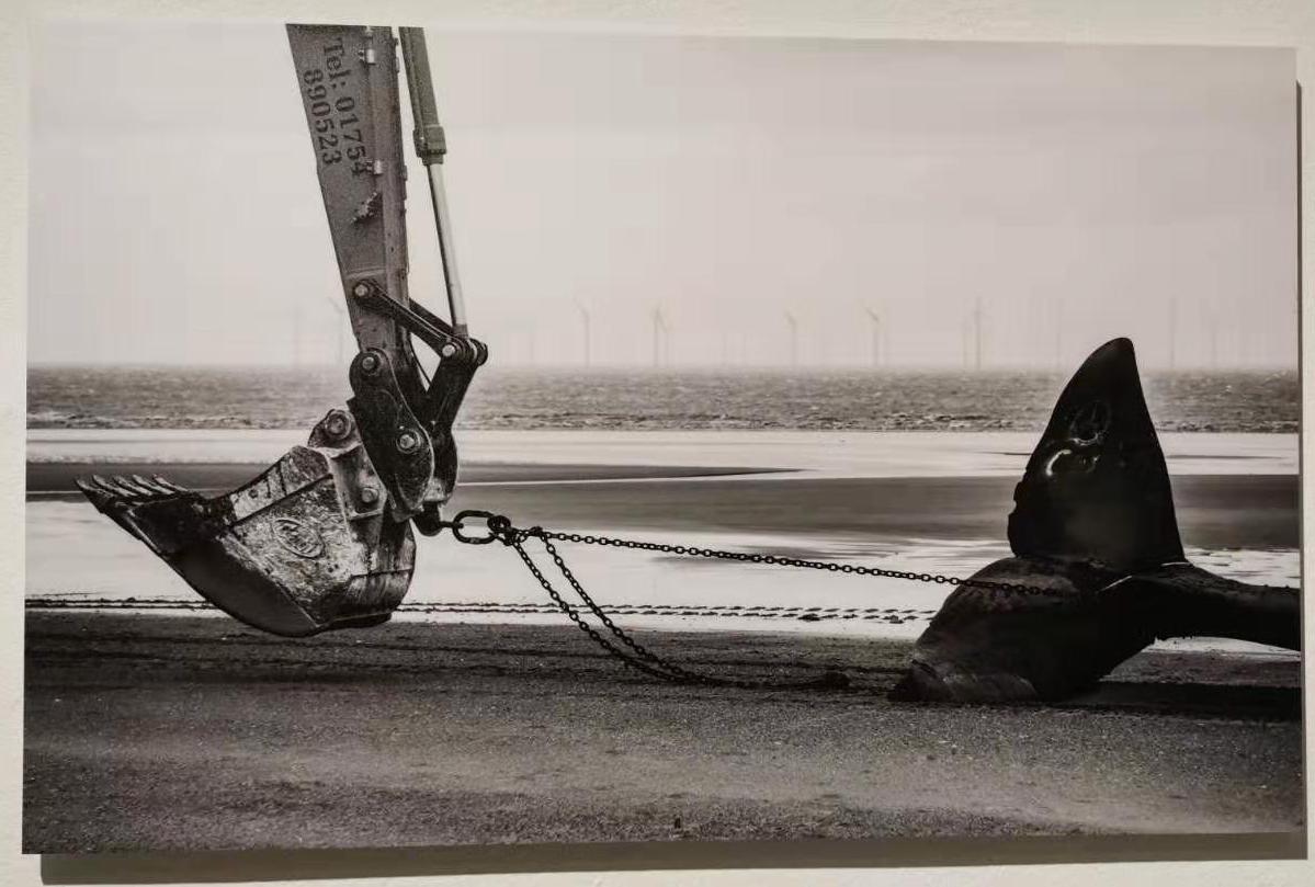
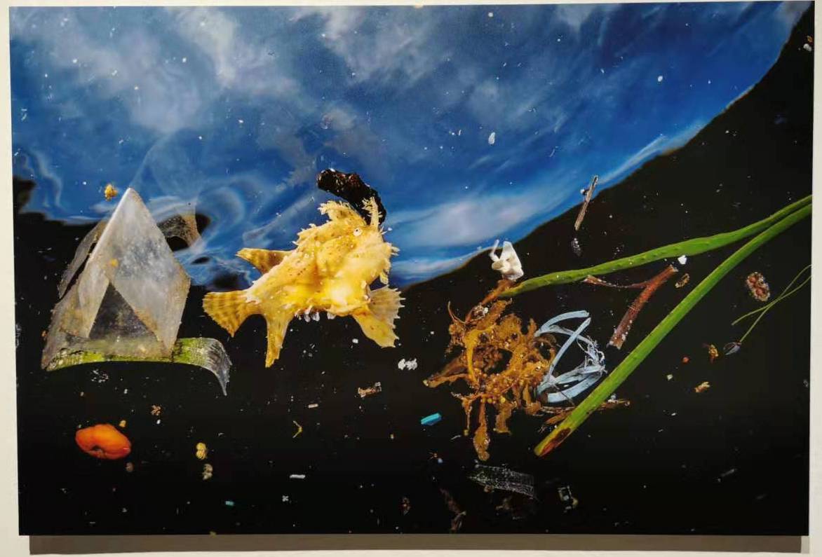
Our group selected the topic about environmental problems. But environment is large topic. So we divided this topic into two parts. One is the climate changing, the other is the human behaviors. And we thought the human behaviors can be directly changed. Then we did the brainstorming for this topic. Finally, we focus on the problem of littering. And we planed to chose three element to do a series of poster.
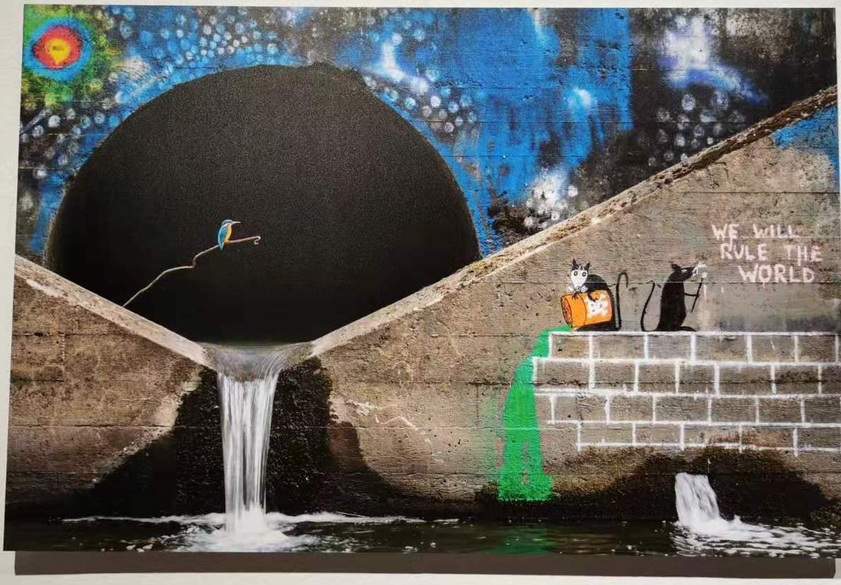
After we identified our topic, we did research on some artists. the first one is Sarah Lucas. He often found some objects to create his works and he used dark humor’s method to express his minds. And the other one is Banksy. Banksy is a street artist and he often paint some graffiti to express his Anti-war ideas. He uses black and white and color contrast to highlight his theme. Their work gives us some inspiration. We plan to make our main animal elements black and white. And the other part will be colored. Such as coral bleaching, we intend to make the coral black and white and use some colored plastic garbage to make the fish around the coral. We will use the similar method to complete the other two posters, hoping to appeal to people not to litter and realize the impact of garbage on animals.

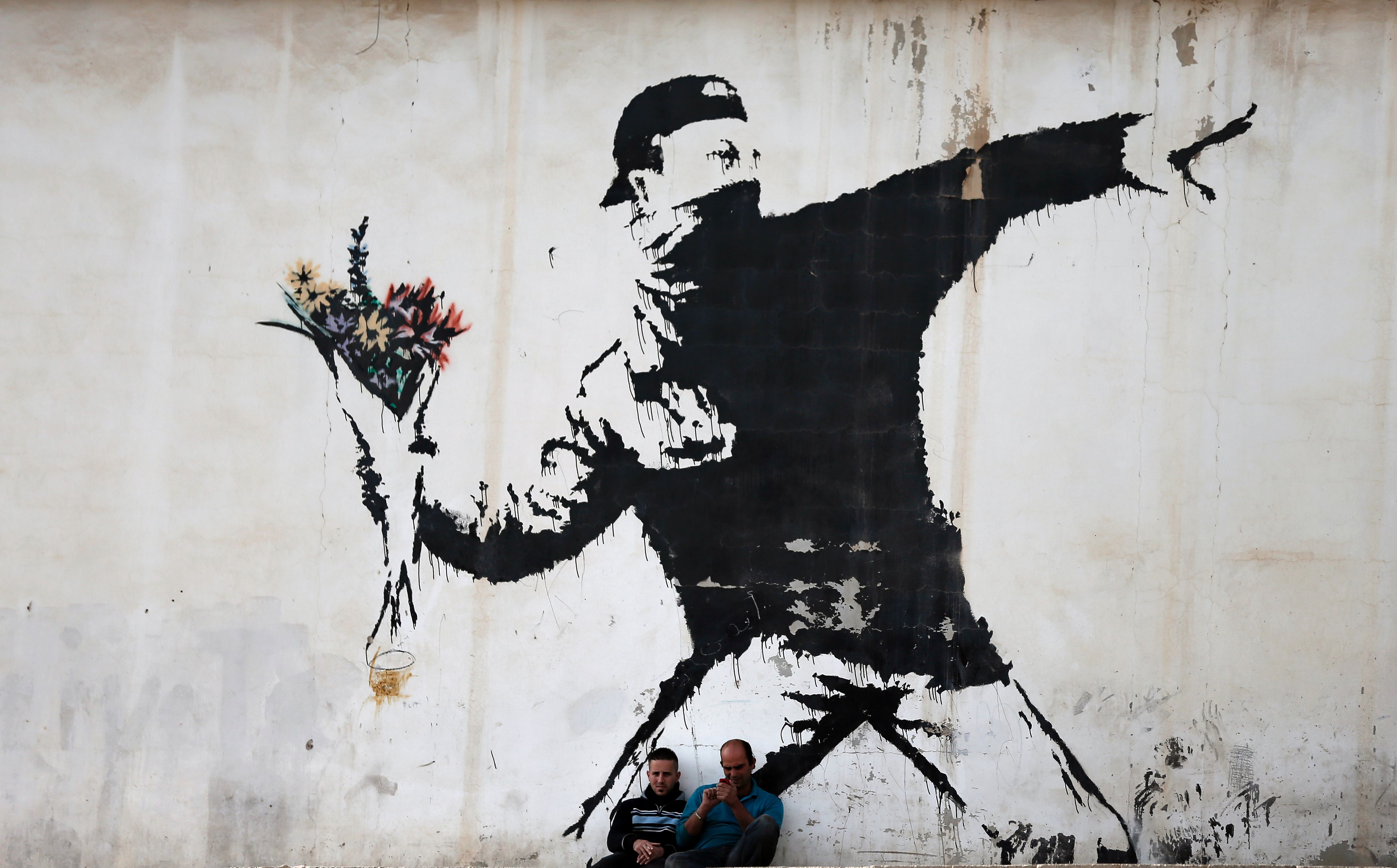
At the last week my tutor showed us a picture about the activism. That picture left a deep impression on me. I like this style about this picture. Fortunately, I was assigned to this artist who draw this graffiti when the tutor asked us to do the research about the activism artist.
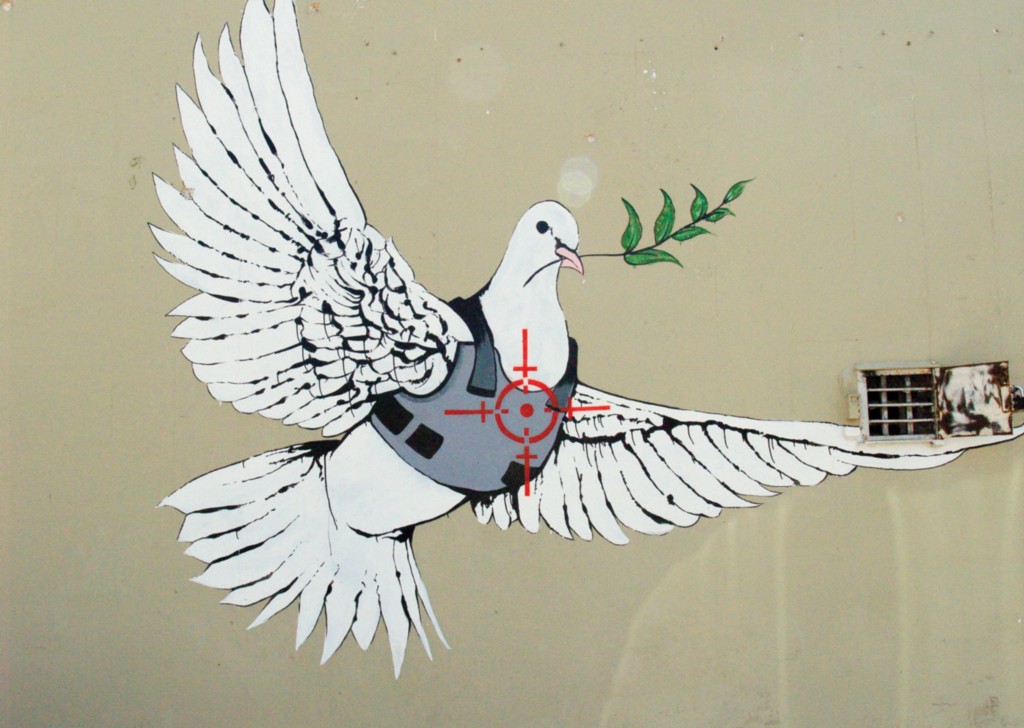
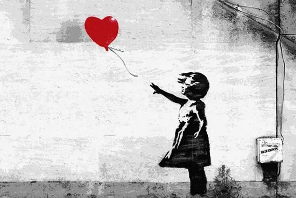
Banksy is a street artist, political activist and film director. He also used different art forms to exposed his idea such as films and graffiti. But his graffiti was very famous. In my opinion, the reason of his success is because he has a distinct personal style and his graffiti is easy to understand. He always use the dark humor with graffiti and use that method to come up his mind about anti-war, anti-capitalist or anti-establishment. whenever you see his work, you will feel strongly that the image in the painting which want to live in the freedom and peaceful world. Banksy’s works are mainly composed of black and white. But what stuff can express the love or peace it will be colorful. For example, a heart-shaped balloon in the hand of a little girl and a bouquet in the man’s hand are both colored.
As for me, expressing in this way can highlight those things that symbolize warmth and love. And I discovered that it’s more impressive with this black and white and color contrast. I think I can use this method in my project or use clip art to present this work. Maybe that way can make our topic more obvious.

After 11 hours of flight, we finally arrived in the UK.
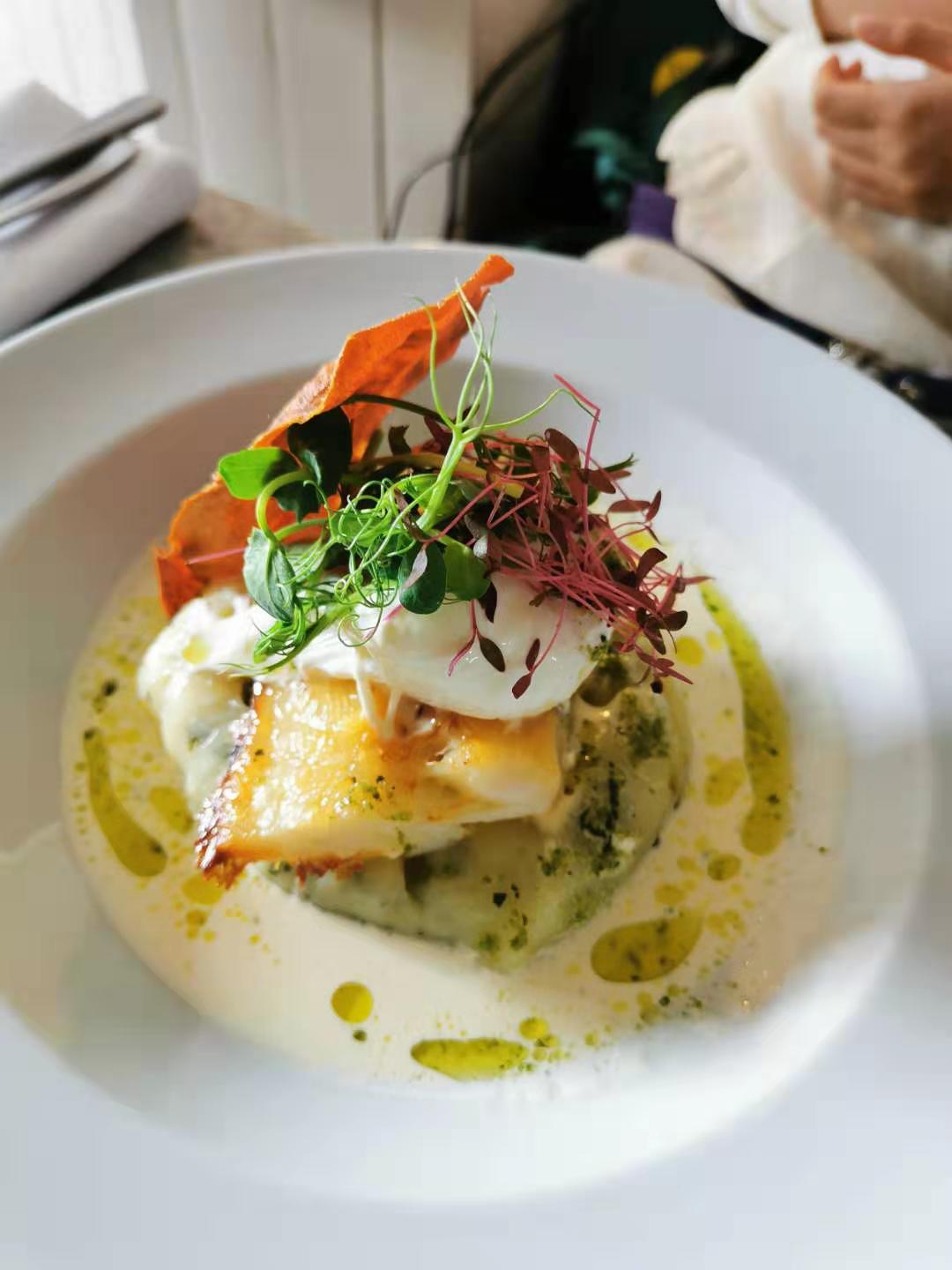
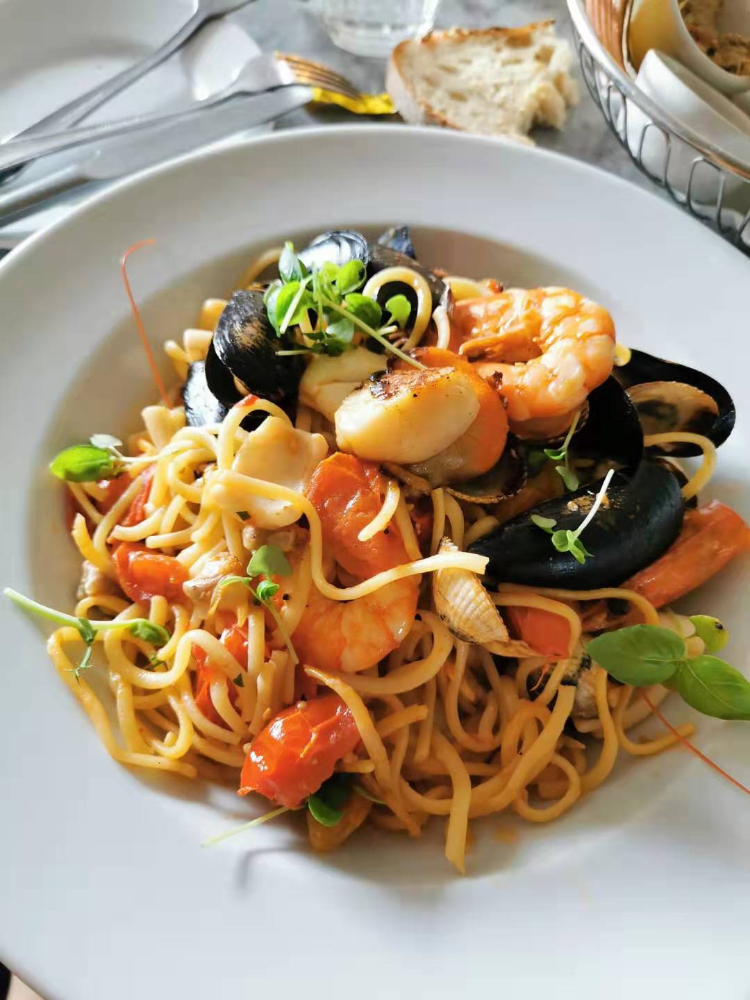

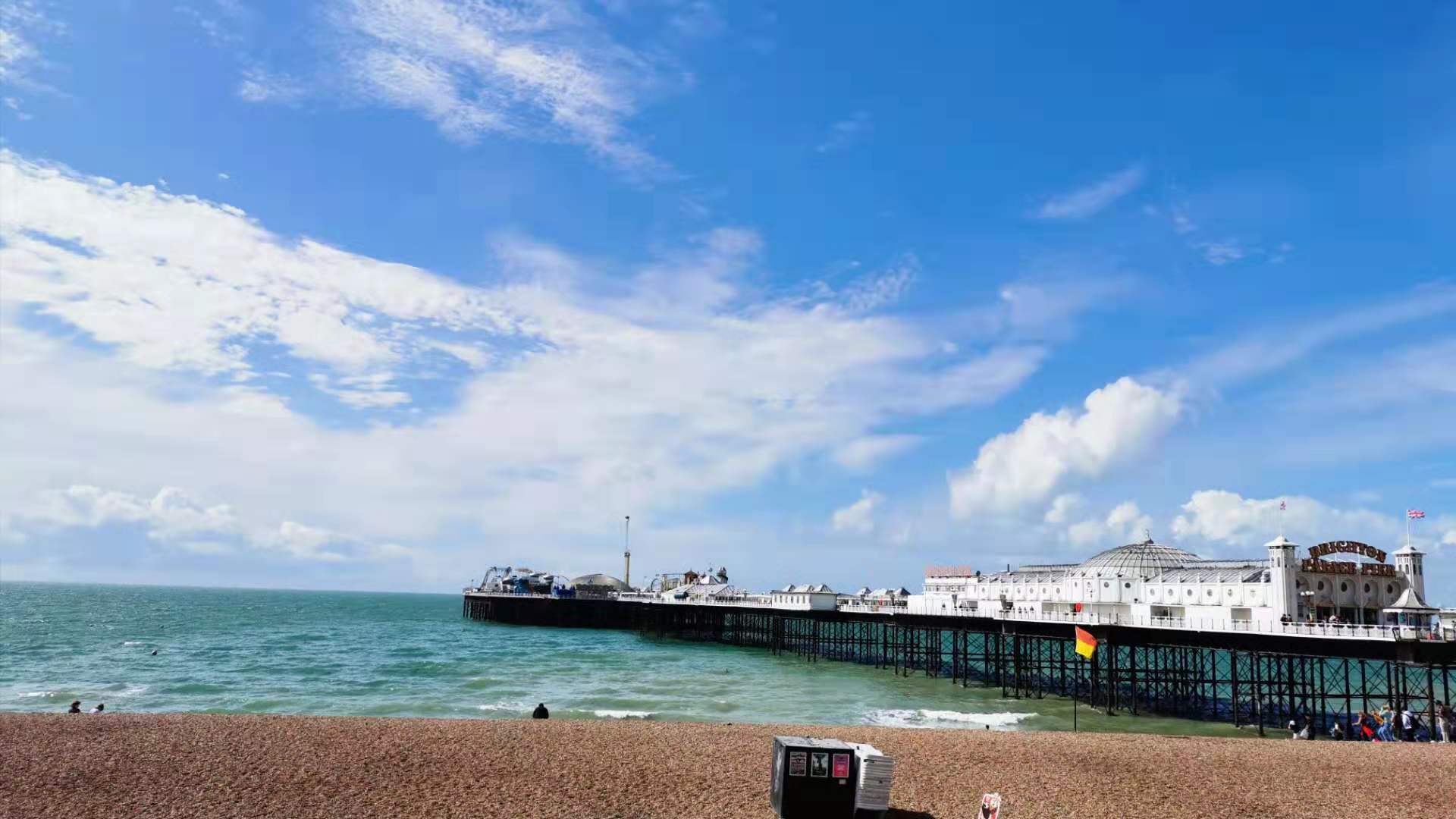
On 9th AUG, we went to the Brighton. There is a costal city in the south of England. There is plenty of sunshine and cobble beach here. And we tasted the local seafood
Overall this is a wonderful and exciting week.
This is an example post, originally published as part of Blogging University. Enroll in one of our ten programs, and start your blog right.
You’re going to publish a post today. Don’t worry about how your blog looks. Don’t worry if you haven’t given it a name yet, or you’re feeling overwhelmed. Just click the “New Post” button, and tell us why you’re here.
Why do this?
The post can be short or long, a personal intro to your life or a bloggy mission statement, a manifesto for the future or a simple outline of your the types of things you hope to publish.
To help you get started, here are a few questions:
You’re not locked into any of this; one of the wonderful things about blogs is how they constantly evolve as we learn, grow, and interact with one another — but it’s good to know where and why you started, and articulating your goals may just give you a few other post ideas.
Can’t think how to get started? Just write the first thing that pops into your head. Anne Lamott, author of a book on writing we love, says that you need to give yourself permission to write a “crappy first draft”. Anne makes a great point — just start writing, and worry about editing it later.
When you’re ready to publish, give your post three to five tags that describe your blog’s focus — writing, photography, fiction, parenting, food, cars, movies, sports, whatever. These tags will help others who care about your topics find you in the Reader. Make sure one of the tags is “zerotohero,” so other new bloggers can find you, too.